
Hello.
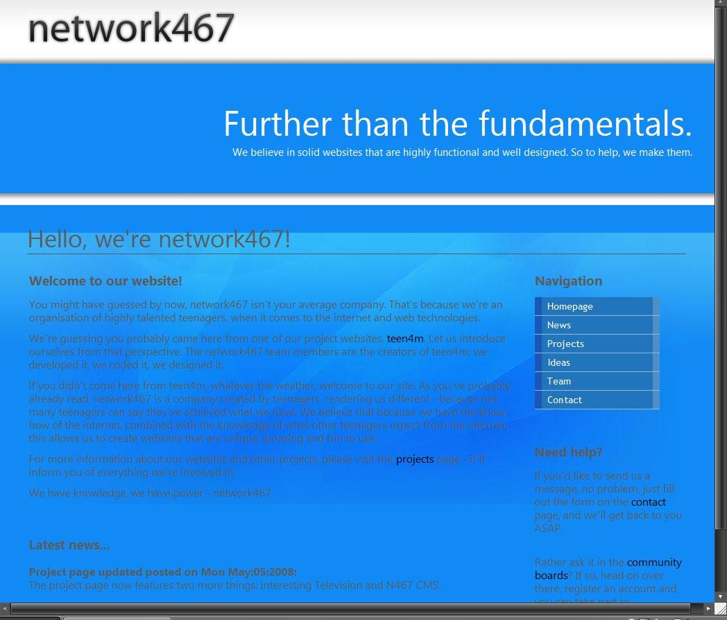
I've recently been working on the new http://www.network467.co.uk, and yesterday I released it with the new template that I've been working on for a while now.
So, what do you think about it? Is it good, bad? Any constructive criticism?
Note: I know there are some tiny IE layout issues where the blue bar is a different size than say FF.
Thanks,
Callum
Site Design
Forum rules
Any off topic discussions should go in this forum. Post count is not increased by posting here.
Archive Access status is required to post in this forum. Find out how to get it
Any off topic discussions should go in this forum. Post count is not increased by posting here.
Archive Access status is required to post in this forum. Find out how to get it

-
happy dude
- Donator
- Posts: 2461
- Joined: Fri Oct 26, 2007 5:12 pm
Simple...nice...
by the way http://www.network467.co.uk/projects.php, "EasyCB" by Jonathon Keogh hasnt been discontinued, a new version was released... nothing too important I guess =\
by the way http://www.network467.co.uk/projects.php, "EasyCB" by Jonathon Keogh hasnt been discontinued, a new version was released... nothing too important I guess =\
I'd describe them more of a difference than an issue after looking at it again. See here:4tified wrote:Nice and Simple layout...very easy on the eyes. (I didn't notice any of the layout issues you were mentioning with IE).
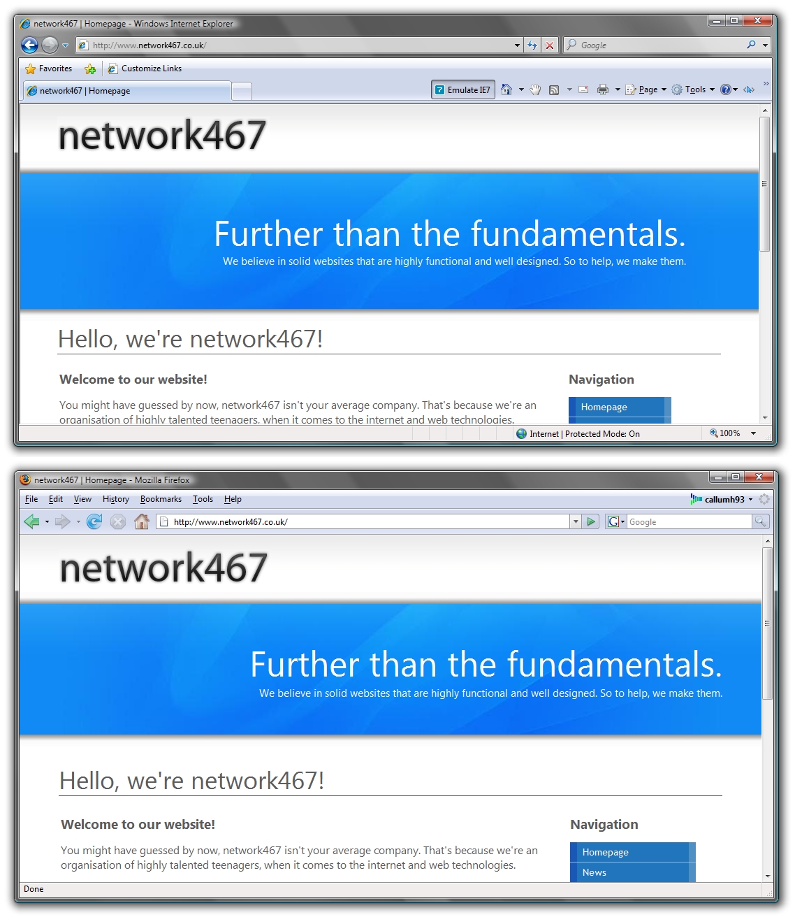
There a very small difference.
Okay thanks for that, I didn't actually write that bit so I'll leave it for nowhappy dude wrote:Simple...nice...
by the way http://www.network467.co.uk/projects.php, "EasyCB" by Jonathon Keogh hasnt been discontinued, a new version was released... nothing too important I guess =\
BTW your link has a comma at the end
-
hounsell
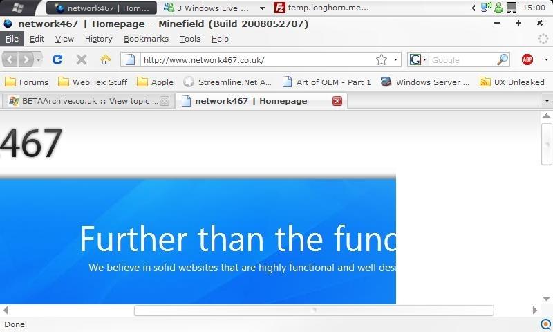
I also see that when I set my laptop to 800x600. I guess the majority of users will be using bigger resolutions by todays standards.hounsell wrote:On lower resolutions, if you are forced to scroll, it looks like this:
I was using my EeePC, so 800px width. I guess it depends if you want to accommodate that sort of small screen or not
-
Rob Jansen

- Donator
- Posts: 5271
- Joined: Sat May 12, 2007 1:05 pm
- Location: The Collection Book
- Contact:


-
happy dude
- Donator
- Posts: 2461
- Joined: Fri Oct 26, 2007 5:12 pm
-
B-Man
Awsome site!!!
I really like your website, the layout is very easy to use and is also very easy on the eyes. The site is displayed fine in IE7 on 1440 x 900.
Also, not sure if you know about this handy tool but you can test your website on just about every web browser I can think of here. From what you said it sounds like you have IE and FF installed physicaly on your computer. This has many versions of eash browser on it and you can test your website on each one. http://browsershots.org/
Because it sometimes takes some time to generate the "Browser Shots" I have already done it for you. Just go to this link : http://browsershots.org/http://www.network467.co.uk/
After looking at the site with browser shots it seems it isn't displayed in Opera well (any version) and in any version of IE before version 7 the header isn't well. In firefox, seamonkey and many other browsers tho it looks awsome.
Edit: For some reason the images never completed and timed out, most of them are there but a few insignificant ones didn't make it... oh well.


-
QuiescentWonder
- Donator
- Posts: 2365
- Joined: Fri Jun 13, 2008 10:22 am
EDIT: I personally think the web design is decent but in the same sense network467 itself is not anybody I would choose to do business with, due to the fact they have had numerous GPL voliatons, and the fact they reshacked some chinese mp4 video software to call it their own, not to mention bundling spyware with it to make a quick buck.
I'm zimmy and I approve this message as it's not flaming or insulting anyone, it's stating facts!
I'm zimmy and I approve this message as it's not flaming or insulting anyone, it's stating facts!
Last edited by stitch on Sun Nov 09, 2008 4:36 am, edited 2 times in total.

I've removed the link in your post because its not appropriate.
Please remember the rules.
Please remember the rules.
You have been warned.Insults, Flaming and Language
- You may not insult any individual, groups of individuals, organisations, etc, regardless of their affiliation with this forum. This includes threats, flames and alike behavior against the same.

I edited it. It shouldn't be breaking rules now.Andy wrote:I've removed the link in your post because its not appropriate.
Please remember the rules.
You have been warned.Insults, Flaming and Language
- You may not insult any individual, groups of individuals, organisations, etc, regardless of their affiliation with this forum. This includes threats, flames and alike behavior against the same.